

TripMaven
End-to-end app (first capstone)
Simplifying the trip-planning process by facilitating natural language destination searches, and seamless booking of accommodations, flights, and activities.

Duration
12 Weeks
Tools
Figma, Otter.ai
Skills
User Research, Layout & Grid Systems, Wireframing, Prototyping, User Testing
Background and Challenges
Planning a trip is something some people love and some dread doing. It can be a lot of upfront work and people can find themselves overwhelmed with the amount of information and resources online. This case study explores the design process for developing a travel app that aims to provide people with a seamless and personalized trip plan while delivering an intuitive and delightful user experience.
Research
Competitive Analysis
Competitive analysis research was used to scope out the current tools being used by people who plan trips. This was helping in understanding the current market, and any opportunities there may be in helping users.
In conclusion, I discovered TripAdvisor was the strongest competitor since it offered activities, travels, and stays. The other competitors did not offer as much services. Some opportunities were tools for collaboration, advertisements, and tools to combat overwhelming amounts of options.


Interviews
I conducted 5 virtual and in-person interviews (people from discord and my family and friends) to ask:
What do people do before trips, during a trip, and how is their experience after a trip.
How different people’s planning affected the trip overall.
After conducting my interviews, I organized my findings into an affinity map to sort my notes so it would make finding a solution easier.
View the affinity map
Key takeaways and quotes from my interviews
Plan ahead = more positive trip experience.
“I'm usually pretty relaxed on trips since I plan ahead of time” - Isabel
Struggle with having to use multiple apps
“We used google maps and yelp to look at restaurants but there were so many to choose from...” - Jenna
Communication among trip members is a struggle.
“Getting everybody on the same page just is a little hard, especially when everybody's remote” - Gaston
Define
Personas

I created the Victoria persona to reflect the more experienced, type-a trip planner who is used to organizing ideas, information, budgets for trips on tools such as google docs or notes apps.

I created the Elliot persona to reflect the more inexperienced planner that might need to help plan a trip with similar experienced trip members.
Generating ideas
I had a timed brainstorming session and thought out some solutions for users based on all of the pain points I gathered from interviews. There were so many ideas that I could imagine being features; it was a challenge for me to focus on a few for this project!

Selected ideas:
Combine planning in one place
Use AI-powered trip planning to customize trips and help travelers feel less overwhelmed when booking stays, flights, and activities.
Share trip plans with others
Why:
I wanted to focus on making the planning process as effortless as possible, since I noticed how planning a trip thoroughly ahead of time and communication positively affected a users trip experience.
Users who planned more stressed less during the trip
Users who planned more had less difficulty communicating with other trip members
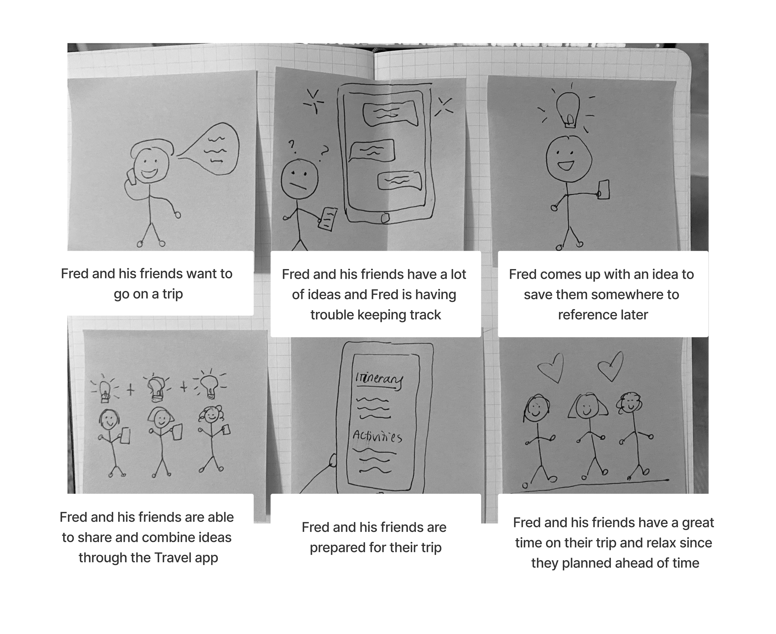
Storyboarding
I sketched out my ideas to help envision the solution and how it would help users.
Sitemap
I created a sitemap to help sort out what pages I would need. I wanted to make this simple and focused around planning a trip.

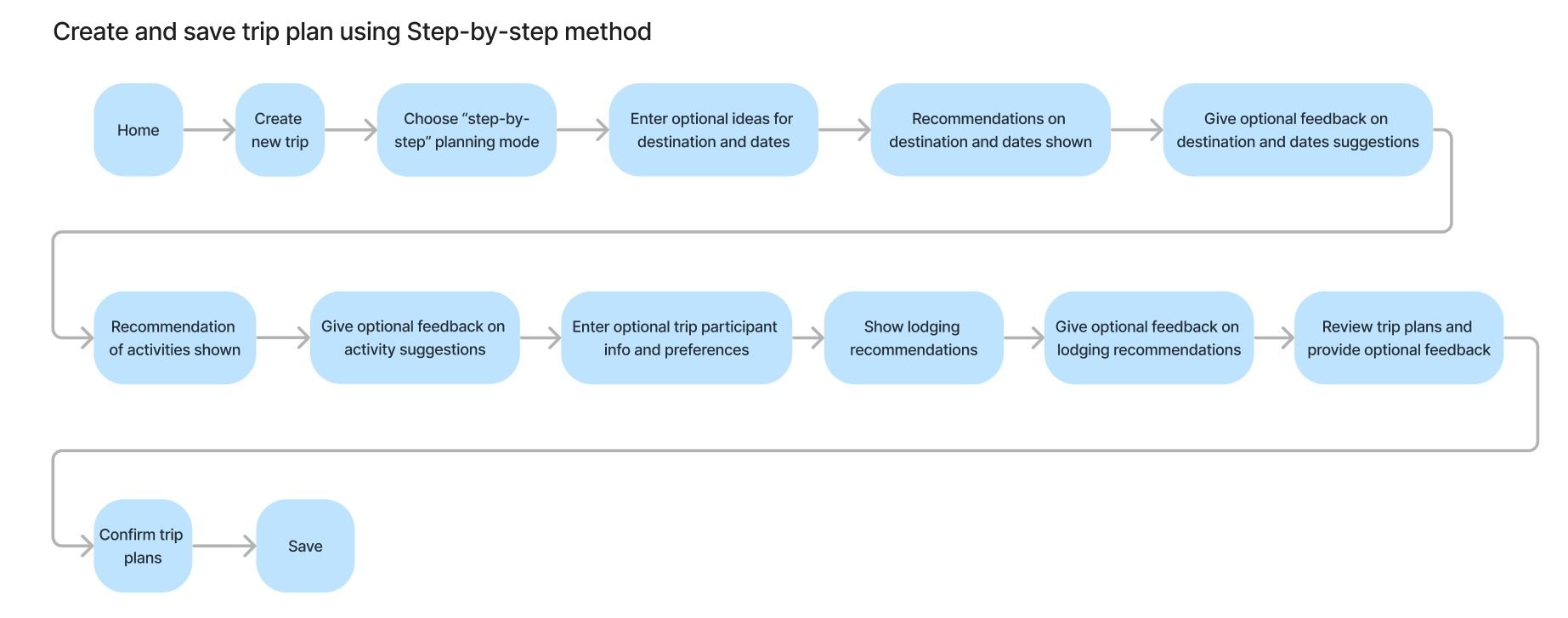
User Flow
This flow describes a user planning a trip step by step in an organized manner so that they can easily select a destination, and save information for booking stays and activities.
Due to the time constraint I stuck with one user flow.

Task Flow
Develop
Low-fidelity wireframes
Sketching my low-fi wireframes were helpful in getting those initial ideas on paper to visualize what my core ideas would look like. I wanted to attract the users attention on the home page to invite users to explore and get excited for a trip, then organize options in a step-by-step mode so that options would be less overwhelming.

Mid-fidelity wireframes
I translated my low-fi wireframes to Figma once I settled on the layout of my low-fi wireframes. These wireframes were helpful in getting a more accurate depiction of my ideas.

Brand identity and mood board

Logo
My inspiration was Traveling tools such as compasses and maps

UI components and style tile
This was my first time creating components in Figma. I used inspiration from Trip Advisor and other apps to focus on a easy and intuitive interface.
I choose a bright green accent to represent discovery and travel since my product will aid people in planning trips discovering new places to visit.

Prototype and Test
Usability testing
I interviewed 5 participants in individual usability tests via google meet. Testers shared their screen and ran through the process of planning a trip by selecting a destination, flights, activities, and saving the plan. I created interactions between screens to simulate the real product for users to test.


Iterations
I removed the planning method screen
4 out of 5 participants had an issue or where unclear with this screen.
Added Search icon
Made the ‘Where to’ (specifying destination) easier for visual people by adding a search icon and better prefilled text. 3 out of 5 participants struggled with this.
Added more detail on destination page
Added a popup screen that displayed information about a destination (summary, reviews, activities, stays). 4 out of 5 participants wanted to see more information.
High fidelity wireframes
I aimed to captivate users with the prospect of planning an exciting trip, starting with a compelling homepage. I then streamlined the experience by illustrating my step-by-step process, where the initial low-fidelity wireframes transformed into a vibrant reality through carefully chosen images, icons, colors, and fonts.

Prototype
Conclusion
This was my first UX project and I got to learn a lot about product design through going through each stage of the design process: Empathize, Define, Ideate, Prototype and Test. I found out I really loved interviewing users and working on the UI.
If I could do anything differently, I would have done shorter user flows so that I could show more of the product and the ideas I had, but due to the time constraint I stuck with one user flow. I also would have tried sketching out more low fidelity wireframes to explore different designs before moving on to higher fidelity prototypes.
My next steps if given more time would to retest my design iterations and measure metrics such as time it take to complete the task and for user errors.
Overall, I learned so much about creating a project from beginning to end and am looking forward to my next project and applying what I learned! This project was so much fun :-) and I’m really proud on how the brand and UI came out.