
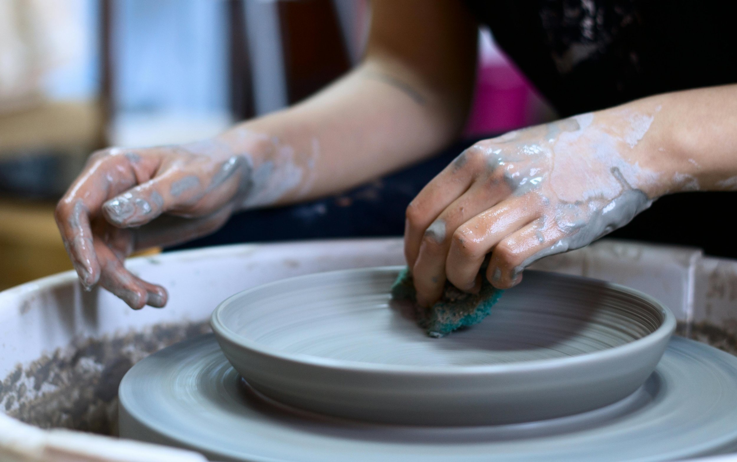
Fire Gallery
Responsive website redesign project
A responsive website designed for a pottery studio, Fire Gallery, to help visitors browse and book available classes, memberships, and add offerings such as classes to their cart.

Duration
80 hours
Tools
Figma, Maze, Otter.ai
Skills
User Research, Typography, Layout & Grid Systems, Wireframing, Prototyping, User Testing
Overview
As a product designer, I identified and improved design elements on the website to enhance user experience, focusing on studio information, class details, memberships, and checkout. I also aimed to capture the studio's artistic essence to boost appeal and sales potential.
Main problem
The current website (firegallery.art) could benefit from improvements in user navigation, particularly regarding accessing information about classes. Additionally, enhancing the organization of content would make it easier for visitors to grasp general information about the studio.
Research
Competitive analysis
Competitive analysis research was used to scope out the different pottery studios in Houston. This was helpful in understanding the current market, and any opportunities for the site.


Opportunities
Each studio had an overall professional website with easy access to information. However, there were some weaknesses among the competitors that gave way for opportunities for Fire Gallery:
Some competitors seemed corporate and contrasted Fire Gallery’s down to earth, independent vibe.
Not all competitors had accessible websites
Not many competitors had general information for beginners
Not all competitors offered courses in addition to classes
User interviews
Questions I wanted to answer in my interviews:
Identity pain points of the visitors using the current site.
Are first time visitors of the site getting the information they need regarding classes offered, memberships, etc.?
User feedback themes
Overwhelming Design
All participants (4/4) mentioned concerns about overwhelming design and the need for better organization and consistency.
Unclear Navigation
Participants had difficulty finding the list of available classes and memberships using the navigation. (3 out of 4 participants)
More info regarding classes and memberships
3 out of 4 participants noted needed more information regarding classes, memberships and/or scheduling
Inconsistency and errors
3 out of 4 participants cited errors on the site such as text written twice, inaccurate links, and other errors.
Given this new information, I decided that since most of the user’s pain points were about difficulty finding information and navigating, I would focus my redesign primarily on establishing:
Clear navigation
More consistency and organization throughout the site
More available and clear information regarding classes and memberships
Define

Personas
Jocelyn is a persona created from the interviews and competitive research that reflects the needs of a pottery class first timer and a working professional who is short on time and needs to find relevant information quickly.
Sitemap
I created a sitemap focused on simplicity and ordered the pages on what visitors of the site would most like to see first, and which had the most content. That way visitors would not have to dig through the menu long before finding what they needed.

User flow
Since most of the user’s pain points from interviews were regarding seeking information about classes, I created a user flow to improve this.
I focused on making the process to find a class as simple as possible, while also creating multiple ways to find a list of available classes so that users easily find what they were looking for.

Develop
Mid-fidelity wireframes
I created low/mid fidelity wireframes which included screens for a home page, classes page, and class detail page to focus on the basic layout and content placement for visitors who need information fast and simple.

Inspiration
I was inspired by earthly colors and pictures of the pottery created at Fire Gallery for the color palette. I wanted colors that reflected passion for creating (red) balanced by the calming and serene colors to reflect relaxation (black, blue, and beige).

Logo, UI components, color palette, and typography
The logo incorporates flames on some of the letters to directly symbolize nature of fire in pottery-making, creating a memorable visual representation of the studio's that will stick in the minds of customers.

I learned how to create interactive components which changed to different states on hovers and clicks. This was important so that I made my design accessible. I also learned how to design components so that they could be reused (atomic design) and creating different states and properties within components.
High-fidelity wireframes and prototype
After creating all of my components, I created my high fidelity wireframes that brought all of my design elements to life as well as my process for visitors to easily find a class and add it to their cart.
Simplified navigation
More information regarding classes such as cost, skill level, duration, what to expect.
A visual guide to the studio’s weekly schedule

Mobile wireframes
Mobile Hi-fi wireframes were created in Figma to replicate the desktop process.
Prototype and test
Usability testing themes
I conducted 5 unmoderated usability tests using Maze. I’ve summarized the themes of those findings below.
New and experienced participants
2 out of 5 testers have taken a pottery class before
Easy to find class information
All testers rated a 5 out of 5 (easiest) on how easy or hard finding the list of classes and detailed information regarding a class
Easy to add class to cart
All testers rated a 5 out of 5 (easiest) on how easy or hard adding a class to their cart was
100% would go here
5/5 testers said yes they would go to this studio after seeing the site.
Usability testing and quotes
In-person interviews
I conducted 3 virtual moderated interviews to test my designs, since I didn’t feel like I got much feedback from my unmoderated tests. I created an affinity chart based on the feedback. View the affinity map here.
Iterations
Other edits:
Changed the speed of component’s action
Changed the On hover action on the available offerings section (home page on desktop only) from 350ms to 450ms to help less overwhelm users based on one of my user interviews.
Edited buggy calendar component
Edited the calendar interactive component to require less clicks. After viewing the maze click rates I noticed it was taking testers more than 1-2 clicks to select a date
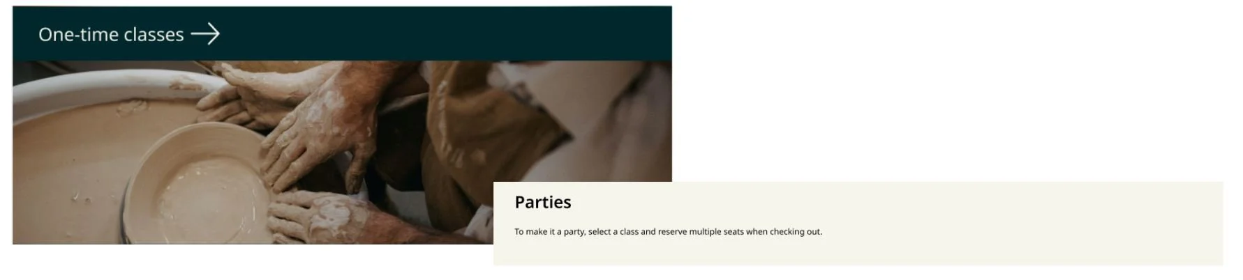
Added a section regarding party information
I added available seats on the reserve spot screen to give more information to users regarding class availability based on user feedback.

Live prototype
Final thoughts
I got so much experience and practice with making realistic and interactive components in Figma. Although I took longer than expected in this project, I’m glad I took the time to learn the tool and get a lot of practice with components, along with working with a real client.
My next steps involve applying my designs to the current Fire Gallery website in WordPress, collaborating with the client. Additionally, I'll track the user experience improvement through Google Analytics. I'll also need to take pictures of Fire Gallery to replace the stock images.